A conscious purchasing companion —
not a tracker.
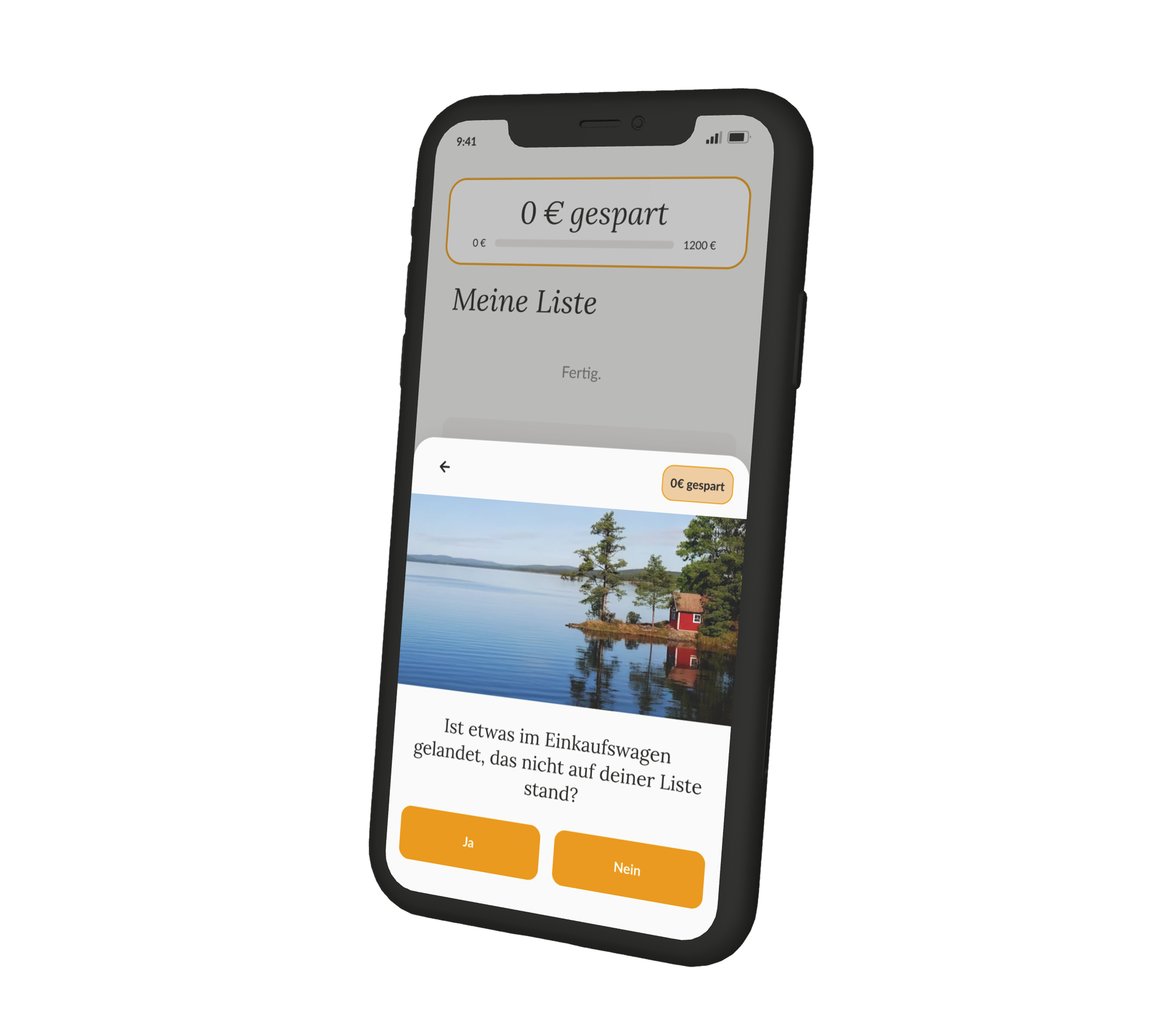
Project Overview
Digitale Leute School, Batch 04/2026
Full-time, solo project
Miro · Claude
The Problem
How might we help Ella notice, in the moment of buying, whether a purchase matches her own priorities — so she feels like she made a conscious decision?
Ella has a steady income and checks her account regularly, but the problem doesn't show up when she reviews her finances. It shows up in the purchase moment itself, where there's no connection between what she's about to buy and what actually matters to her. By the time regret arrives, the money is already spent.
33 surveyed respondents and all 7 qualitative interviews confirmed the same root pattern: people act on impulse in the purchase moment without checking it against their own priorities. Existing finance tools only document this after the fact. They don't intervene at the moment it happens.
act on impulse without checking their own priorities
Design principles: No shame-based design · No failure states — the counter only ever rises · No coaching language — "mirror not coach" applied to every screen
My Contributions
End-to-end, one decision at a time
Built solo across the full bootcamp timeline, from problem framing to a tested Hi-Fi prototype.
- Ran 7 qualitative interviews and a 33-respondent survey to validate the core hypothesis
- Framed the persona (Ella, the "autopilot buyer") and the HMW question from that research
- Designed the shopping-list-to-PopUp trigger flow as the core interaction
- Ran usability testing with 6 participants, logged 26 findings, and iterated the wording and interaction flow based on results
- Built and maintained the full design system, typography, color palette, and components, in Figma, using Figma Make to speed up the initial setup and the first Hi-Fi prototype structure
Process
Five phases, three pivots, one confirmed trigger
Research & Insights
Grounded the problem in both qualitative and quantitative research rather than assumption: 7 interviews plus a 33-respondent survey. The strongest pattern across every single interview was the same root cause — no reflection at the moment of purchase, only retrospective regret.
The data confirmed a real tension: 67% act on impulse without checking their own priorities, while 58% say it's important or very important to know whether a purchase matches them. That gap is what the product needed to solve.
"I have the feeling I spend so thoughtlessly. So many small things — a coffee here, a pretzel there — at the end of the month it's 900 euros you've basically spent on nothing."*
"I didn't really think about it much, it was just this feeling of, I'll treat myself right now."*

Ella — the "autopilot buyer" the research pointed to
Concept
Three decisions shaped the MVP — each one a direct response to a failed alternative:
- No additional finance overview. The problem isn't missing oversight — it's the autopilot in the purchase moment itself.
- No supermarket coupon-app trigger. Supermarkets have no interest in less revenue. Social pressure and shame while standing in the checkout queue make putting items back feel unrealistic.
- No evening reflection flow. The autopilot can't be broken retrospectively — only in the moment itself, not looking back.
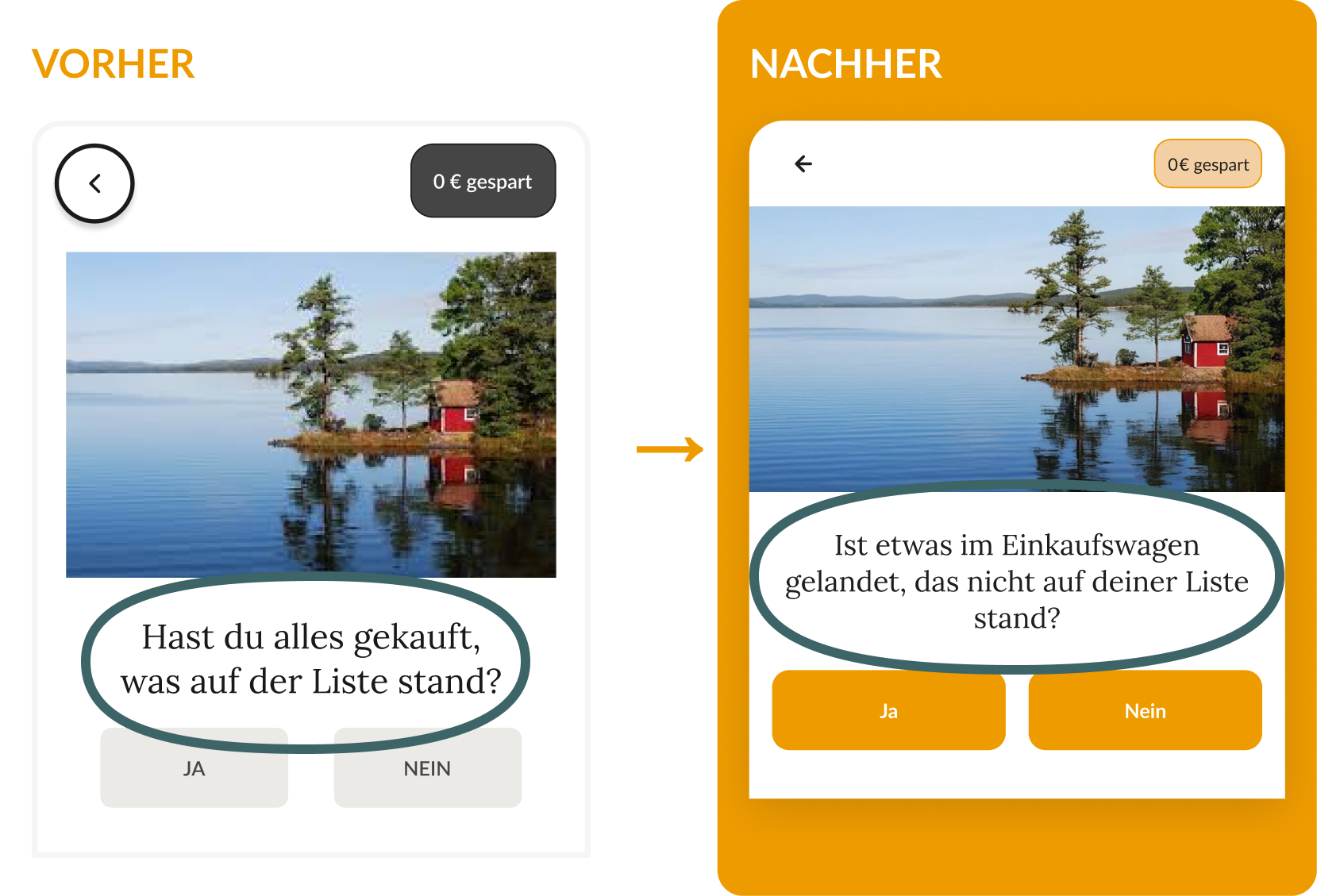
The result: an in-app shopping list where the trigger lives entirely inside the app itself. Ella creates her list in AtemPause, checks off the last item — and the PopUp appears before she joins the checkout queue, giving her a brief pause to think.
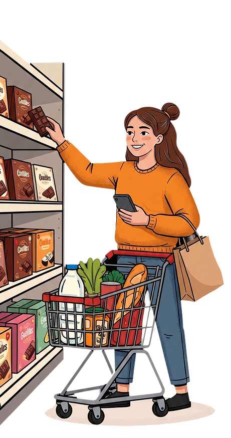
The trigger moment: last item checked off, before the checkout queue
Wireframes & Prototyping
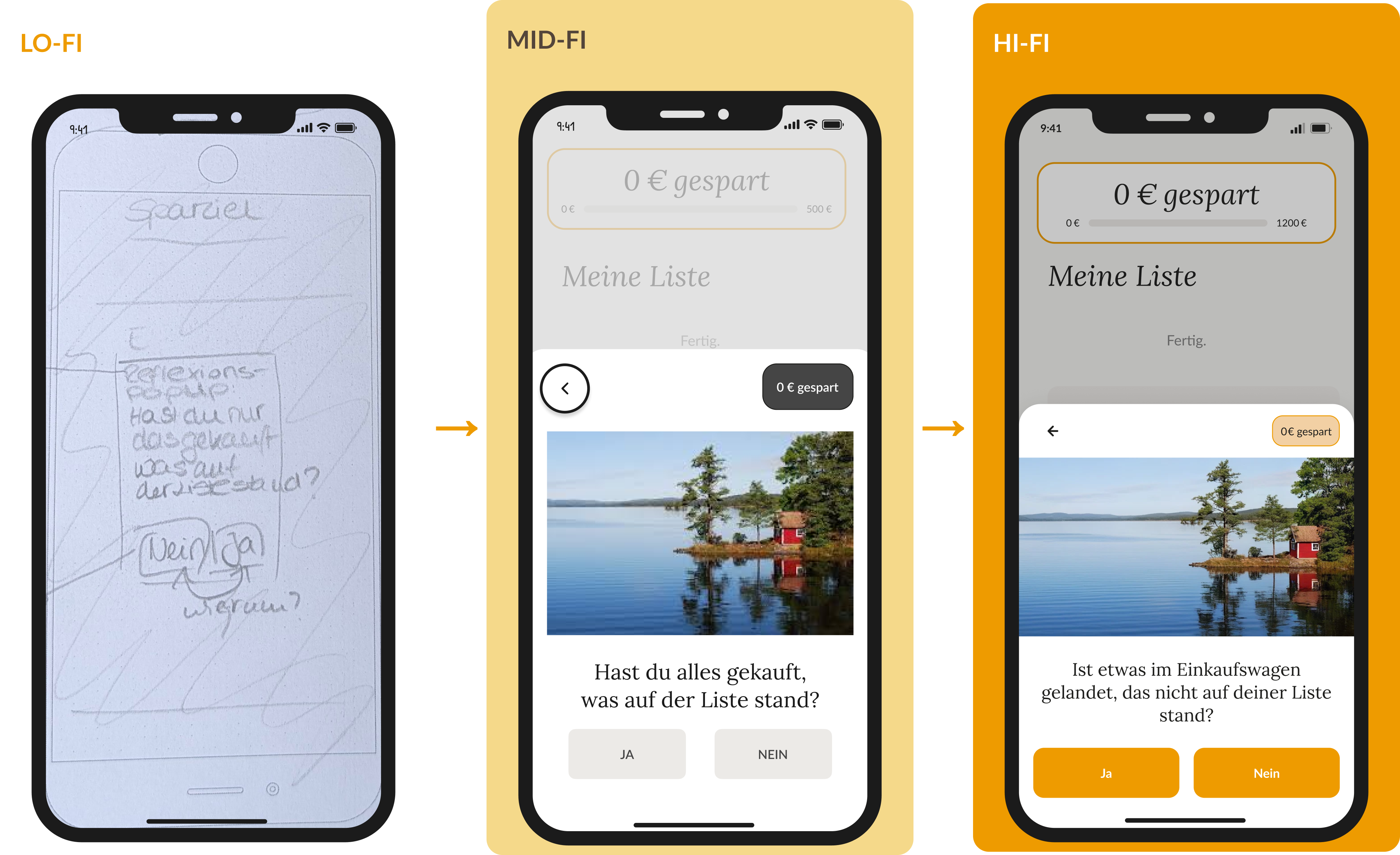
Two fidelity stages, evaluated before moving forward at each step.
Key Design Decisions
Each decision came from a specific finding or failed prototype, not a stylistic preference.
- PopUp wording rewritten to present tense. Original phrasing confused 5 of 6 participants — "gekauft" implied the decision was already made. Rewritten to an immediate, neutral question anchored before the checkout.
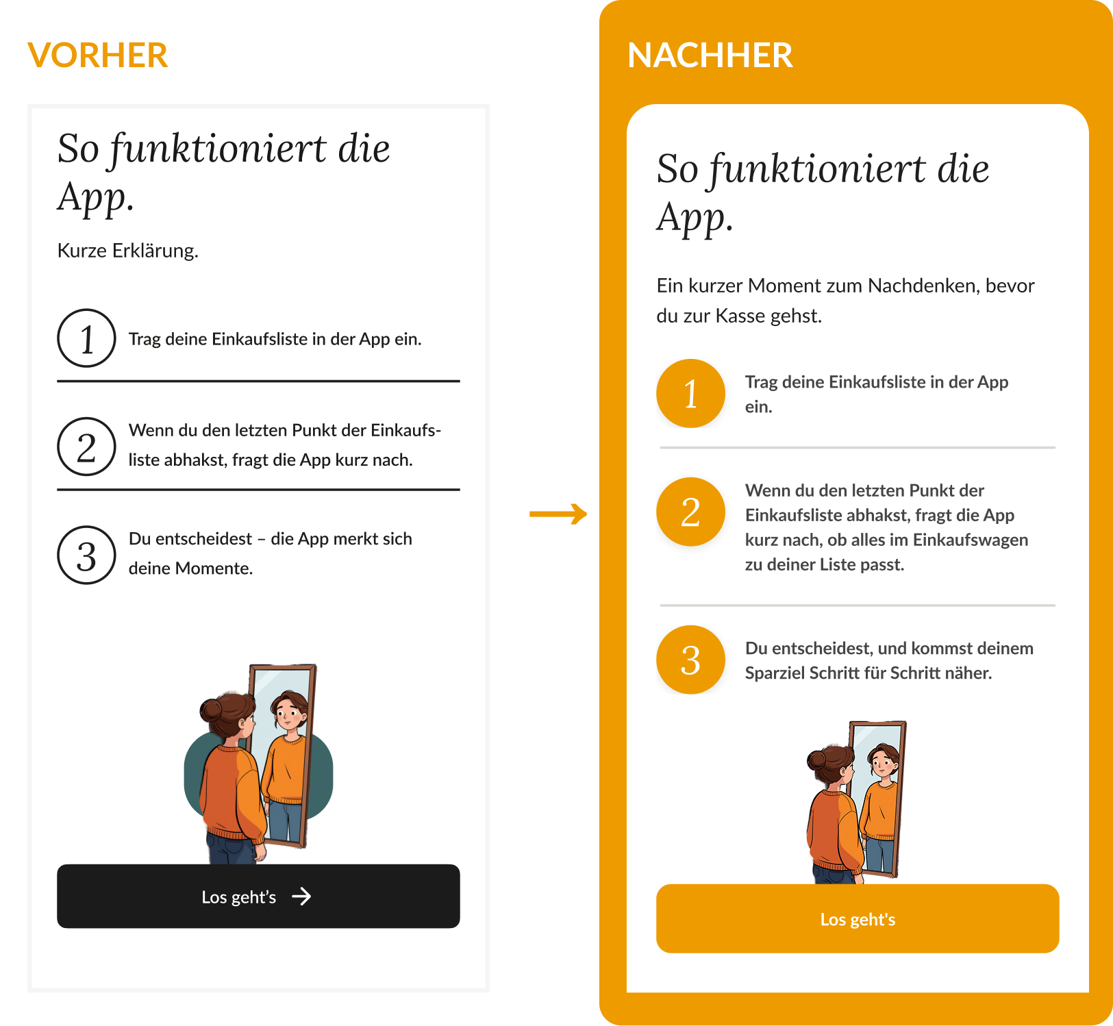
- Onboarding language simplified. The term "Momente" was unclear to 3 of 6 participants. Replaced with a concrete three-step explanation of exactly what happens and when.
- Evening reflection flow removed entirely. Reflection moved to the purchase moment — evenings offer no real motivation to revisit a decision already made hours ago, it just feels like homework nobody wants to do.
- Post-decision feedback added. A small neutral animation confirms the input was registered — without praise or judgment.
- Savings tracking limited to explicit choices in V1. If something is left out of the cart before it's ever added, there's no automatic way to log it as a conscious decision. Scoped deliberately for manual entry in V2 rather than adding complexity to the V1 trigger logic.
Testing & Iteration
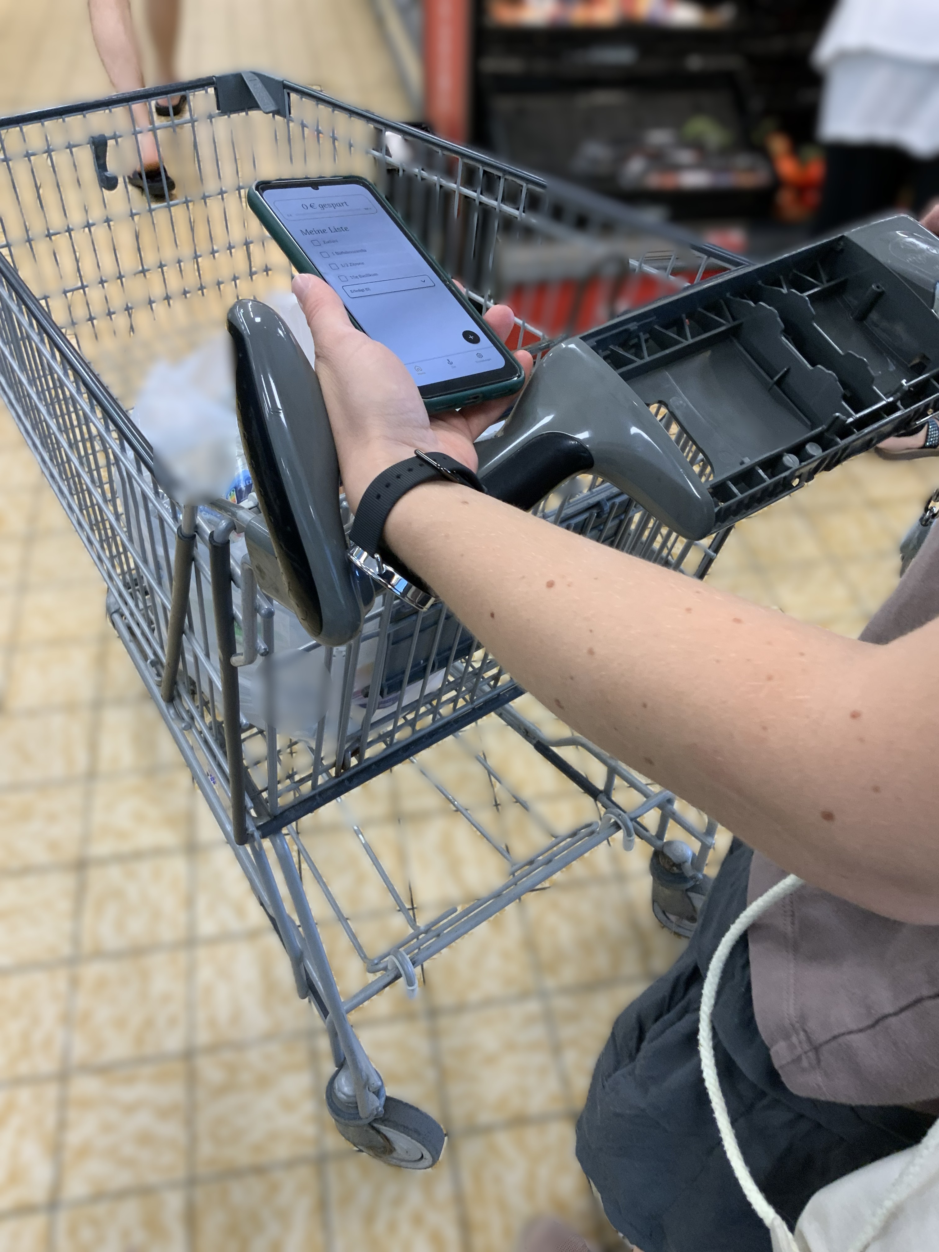
Usability testing with 6 participants — 4 remote, 2 live in-store under real conditions: time pressure, checkout queue, one hand available. 26 individual findings logged and translated directly into fixes.
Task Success Rate: 100% — all 6 participants responded actively to the PopUp instead of dismissing it. The trigger interrupts autopilot behavior at the intended moment.
Confidence Rating was also tracked and came back low for the original PopUp wording, consistent with the confusion found in testing.
of participants responded actively to the PopUp instead of dismissing it

A conscious decision — not a restricted one
* Research conducted in German; quotes translated for this portfolio.
Result
Interactive High-Fidelity Prototype
Built in Figma. Click through the onboarding to set the target, then the shopping list, the PopUp decision moment, and the rising Euro counter.
Reflection
What I'd do differently
This was a 4-month bootcamp project, not a shipped product. What it demonstrates: a hypothesis tested against real behavior, not a gut feeling, and a willingness to cut features that couldn't be defended as intentional.
Split testing into smaller iterations
This round tried to validate wording, onboarding, and the trigger mechanic all in one pass, testing each piece separately would have made it easier to isolate what specifically wasn't working.
Test the riskiest assumption earlier
The core question — whether the trigger interrupts autopilot at all — was validated late relative to how central it is. Testing it in the first weeks instead of after the Hi-Fi build would have been the stronger sequence.
Retest the revised PopUp wording
The original phrasing confused 5 of 6 participants — and the Confidence Rating was low precisely because of it. The wording was updated, but the revised version hasn't been retested yet.
Next testing steps
- Retest the revised PopUp wording to confirm the confusion is resolved.
- Does the participant notice the automatic switch to the goal tab after the PopUp decision, and understand the connection to their own savings progress?