A learning app for pre-readers,
built around a story — not a quiz.
Project Overview
Mobile Media / UI Design course
WS 18/19
Affinity Designer · Eye-tracking
The Problem
Teach real preschool content in a way pre-readers can follow on their own, while keeping it playful rather than task-like?
Existing preschool learning apps cover the right content but often lose the child's attention through unclear structure or task-heavy interfaces. The challenge was to teach real curriculum content — first math concepts, nature and environment, language — while staying playful enough for a 5 to 6 year old to use without adult help.
Designing for this age group carries its own responsibility. The interface had to work without relying on reading ability, adult supervision, or prior app experience. A 5 to 6 year old can't compensate for unclear design the way an adult user would.
UX goals: Self-explanatory without requiring reading skills · Consistent visual language across all learning modules · Playful frame instead of a test-like feel
My Contributions
Shared ownership, not a task split
Built together with Marlis Reinhardt throughout — decisions on content, story, and structure made jointly.
- Defined the information architecture and navigation hierarchy
- Designed the difficulty-level icon system (stick figures)
- Built the read-aloud / audio concept
- Wrote and designed the story content for all three learning categories (leaves, numbers, letters)
- Created original illustrations in Affinity: puzzle piece, leaf, letter and number category icons, color-splash icon, and the story scenes (baking, school, painting); assembled the forest scene
- Wrote the evaluation strategy for the eye-tracking test
* The fox character itself was designed by Marlis
Process
Five phases, three rounds of testing
Research & Insights
Grounded the learning content in official German and Austrian preschool curricula (Baden-Württemberg and Austria's federal education ministry), rather than assumptions about what preschoolers should learn.
A competitive analysis of three existing learning apps and one learning-pen product surfaced a clear gap: every competitor offered isolated mini-games. None built a continuous story.
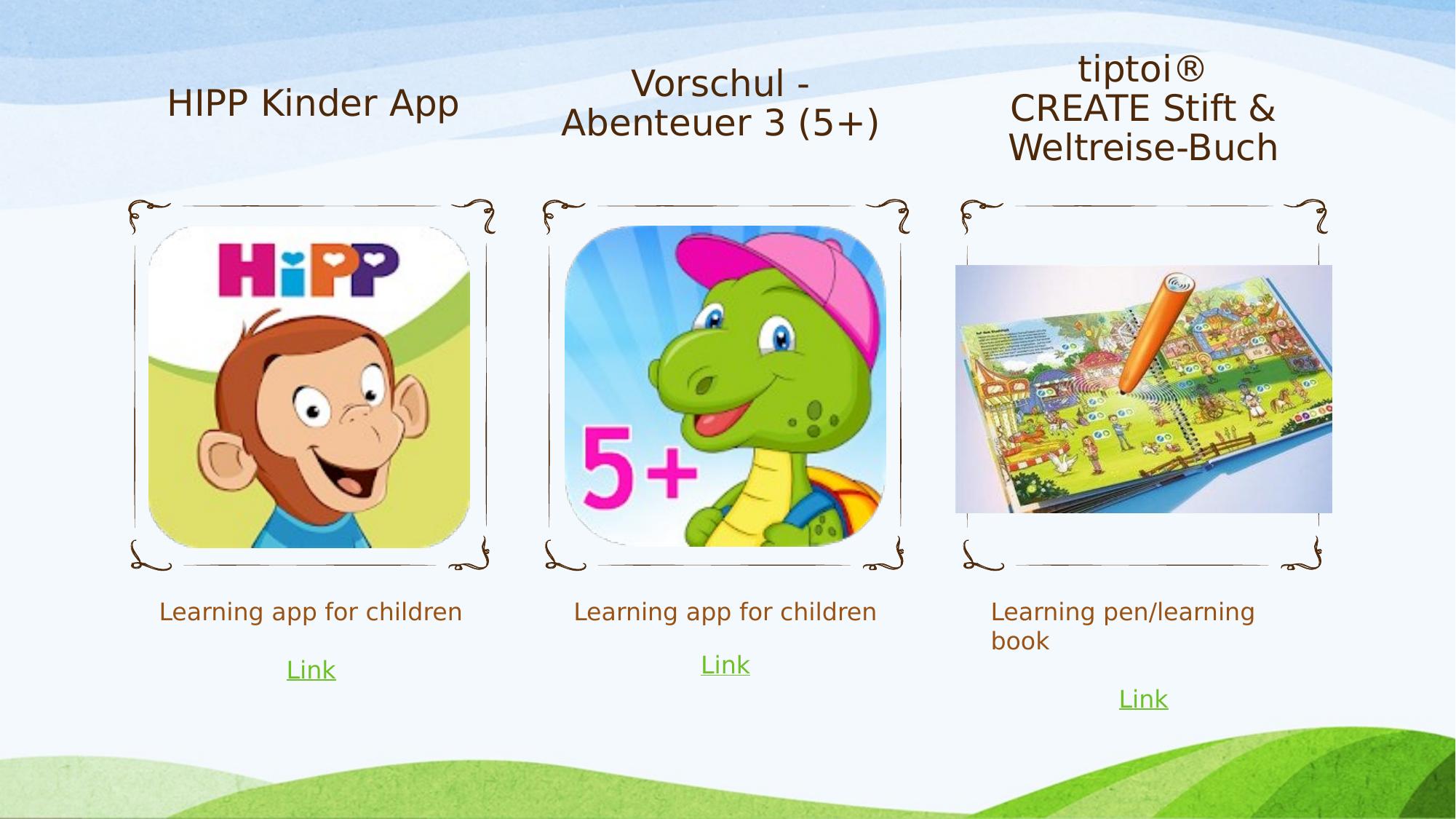
Key finding: "clearer structure, a more gripping story, for better concentration" — that was the open space.
Concept
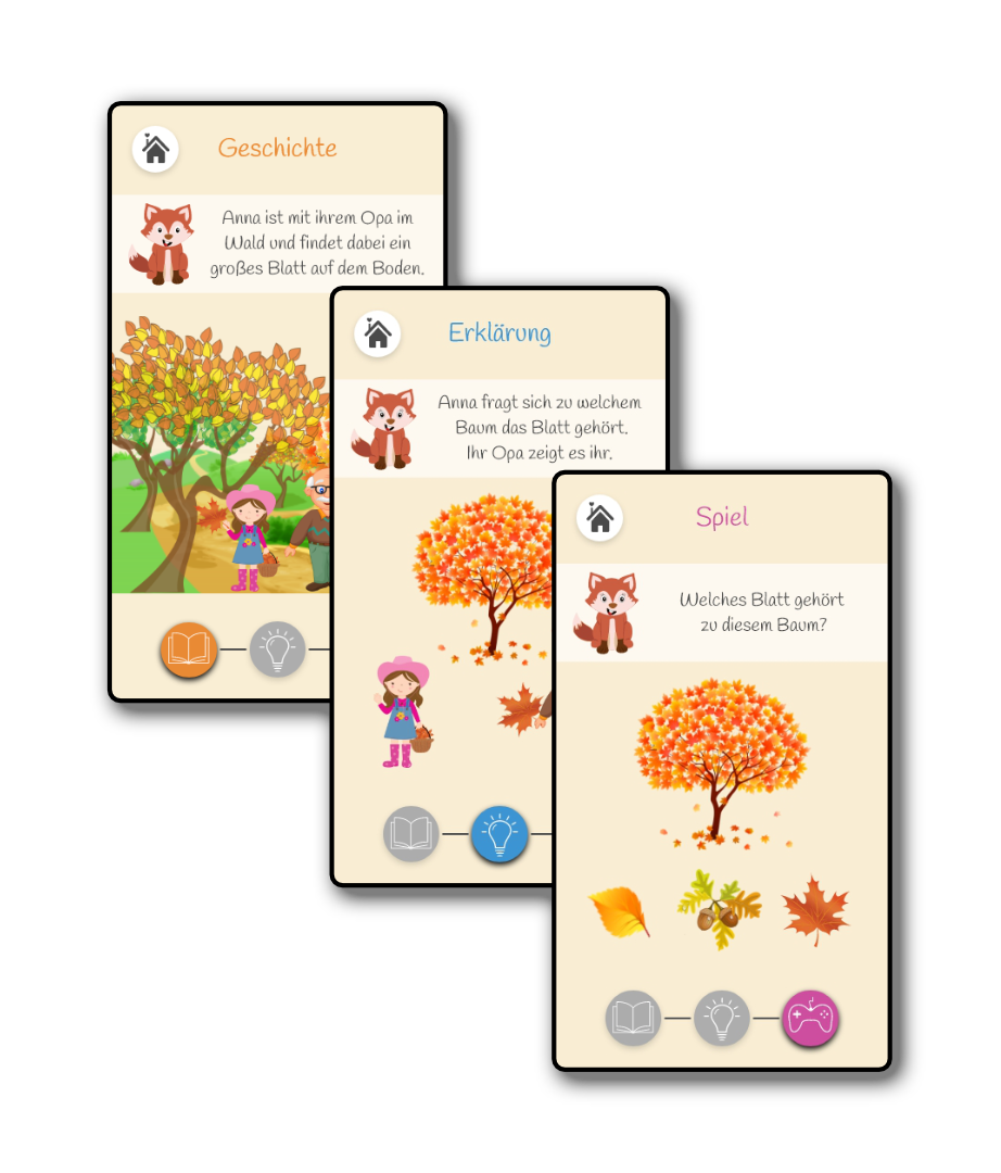
Chose a continuous story — Anna and her grandfather finding leaves in the forest — instead of a sequence of unconnected mini-games. A direct response to the competitive gap.
Built a consistent metaphor system across categories: a paintbox for painting, a basket that visually fills as leaves are collected. Not one-off icons per screen, but a coherent visual language the child learns once and applies throughout.
Wireframes & Prototyping
Two fidelity stages, evaluated at each step before moving forward. Between them, we defined a UI kit — the shared color system, icon set, and characters both stages draw from.
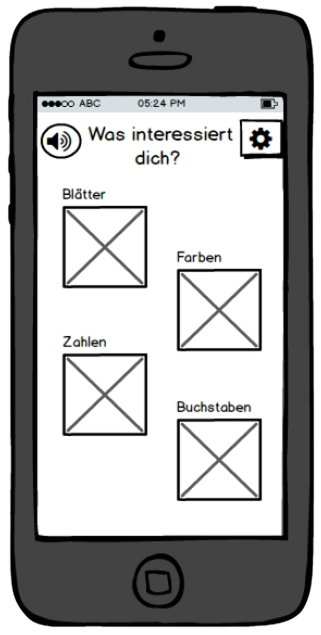
Low-Fidelity Wireframe
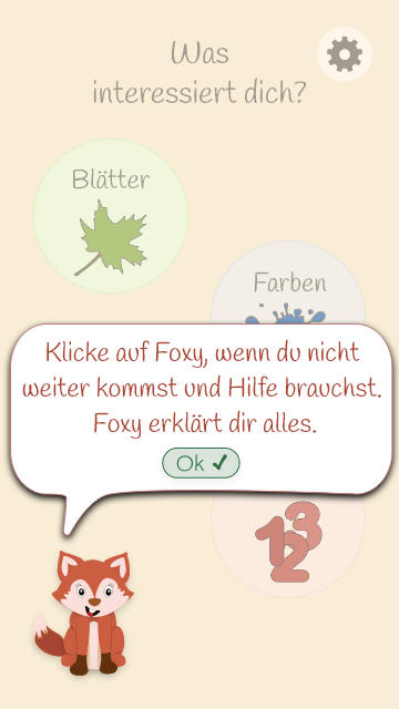
High-Fidelity, Adobe XD
In between: the UI kit
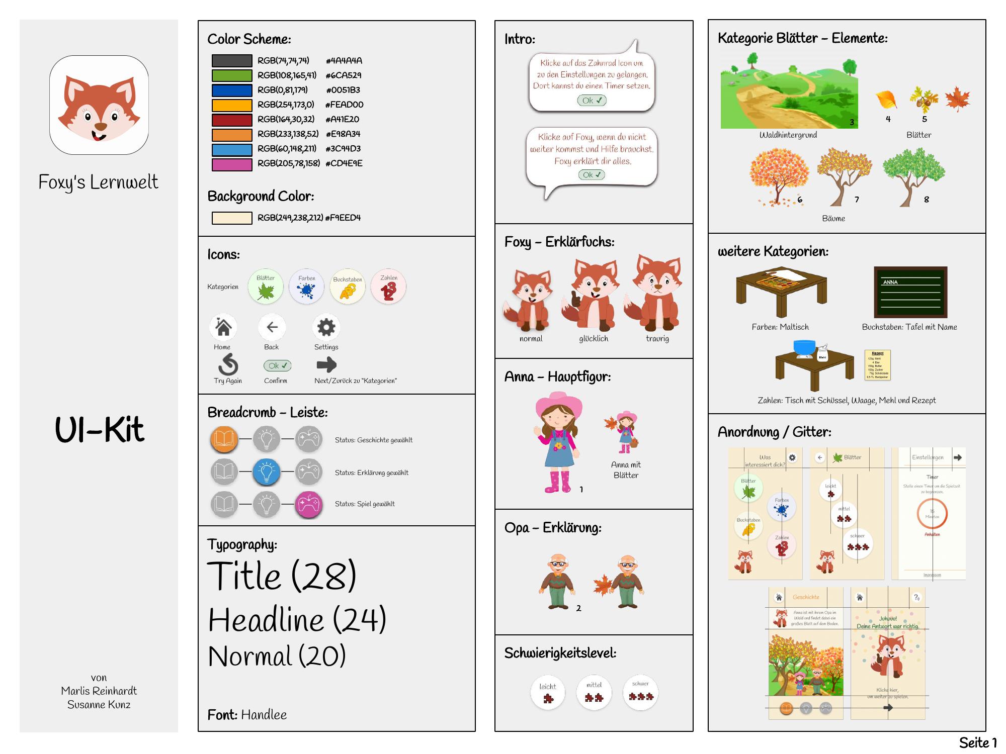
Key Design Decisions
Each iteration produced concrete changes. These weren't stylistic preferences — they came from test findings.
- Difficulty levels: 4 → 3. The first level was redundant and unclear in testing. Removed it.
- Home screen: separate landing → category screen directly. The original landing layer tested as unclear. The category screen became the entry point.
- Speaker icon removed from difficulty levels. Testers didn't understand what it meant there. The speaker icon elsewhere was also replaced with a speaking-person icon for clarity.
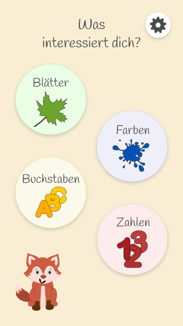
- Burger menu → gear icon for settings. A more universally recognized symbol for the target age group's parents and caretakers.
- "Kategorien" → child-friendlier language like "What interests you?" — evaluation flagged the original German term as unsuitable for the age group.
- Fox guide character: Already planned before eye-tracking. The test independently confirmed the need for a reference figure — validation of a decision already in progress, not a new one.
Testing & Iteration
Three separate evaluation rounds: usability testing on the functional prototype, separate evaluation of the graphic mockup, and eye-tracking on the high-fidelity prototype. Findings from each round were logged and translated directly into fixes for the next stage.
Eye-tracking result: of three testers, only one noticed and used the read-aloud function. The other two missed it entirely — feeding directly into the fox guide character decision.
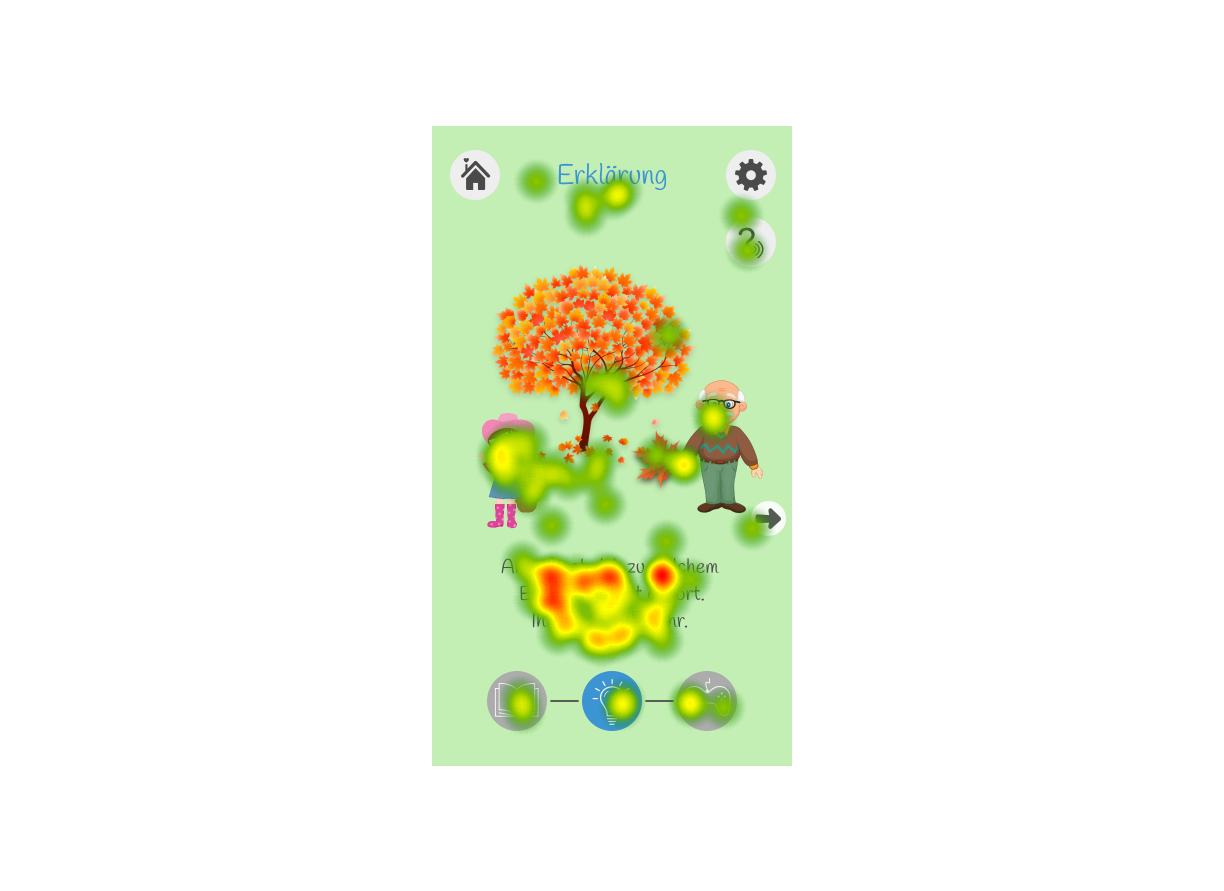
"All test participants were adults, not the 5 to 6 year old target group — documented upfront as the main constraint of the evaluation."
Result
Interactive High-Fidelity Prototype
Built in Adobe XD. Click through the full story flow, difficulty selection, and the read-aloud functionality.
Open Issues
What we didn't resolve
Identified during testing, but left open within the project scope.
Breadcrumb vs. "next" arrow confusion
Unclear which element was the way forward and how to navigate back. The dual affordance was never fully resolved.
Breadcrumb icons looked disabled
The visual treatment made them appear unclickable even when they were interactive. Testers didn't attempt to use them.
Reflection
What I'd do differently
This was a university project, not a shipped product. What it demonstrates: a concept grounded in real competitive analysis, refined across three tested iterations — not a gut feeling.
Bring in pedagogical expertise
The learning content was grounded in official curricula, but a pedagogical specialist would have strengthened the content design and age-appropriateness more directly.
Test with the actual target group
All three test rounds used adult participants. Real usability sessions with 5 to 6 year olds would have surfaced fundamentally different — and more relevant — problems.
Test for comprehension, not just completion
Eye-tracking showed where participants looked, not whether they understood. Direct observation of children using the app would be a different kind of evidence altogether.